Learning from Netflix’s New Logo Design

Written by Matt Clement
June 17, 2014
There is nothing as closely tied to your brand as your logo. You’ve worked hard with ad campaigns, PR techniques and branded T-shirts to associate your logo with your particular brand offerings. Your logo has seen you through changes in the industry, business growth and development, and battles with the competition. But therein lies the struggle: you work so hard to establish your logo as representative of your brand that when your brand needs to shift to meet the needs of the changing marketplace, your logo sometimes get left behind.
Consider that your logo is what sets your brand apart, while simultaneously giving viewers a graphical reference of who you are, the industry you’re in, and what you’re offering. If any of those pieces change in your business, there’s potential for your logo to change as well. Over the decades the marketplace has offered many examples of logo evolution, especially among well-known brands like Windows or Apple or Starbucks. Now Netflix has joined the ranks of brands that have changed their logos due to changing consumer behavior and industry.
(Learn More About Developing a Digital Brand Strategy)
Understanding Netflix’s Logo Design
Since we’re not a part of the Netflix marketing team, we can only speculate as to why Netflix decided to make the change, but understanding logo design does give us some direction. Paul Rand, a graphic designer known for creating the logos for corporations like ABC, IBM, and UPS, had this to say about logos:
“A logo is a flag, a signature, an escutcheon.
A logo doesn’t sell (directly), it identifies.
A logo is rarely a description of a business.
A logo derives its meaning from the quality of the thing it symbolizes, not the other way around.
A logo is less important than the product it signifies; what it means is more important than what it looks like.”
Take a look at the new logo here on black and white backgrounds, courtesy of Business Insider:
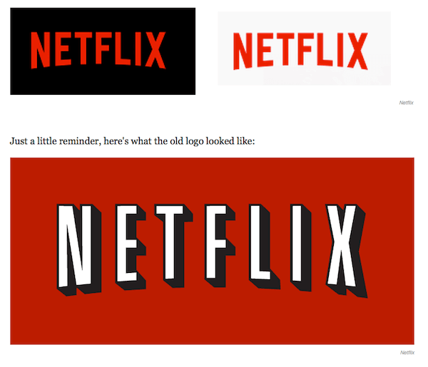
The Netflix product has grown from being a disc distributor for a subscription fee to so much more. As the products have changed, so has the competition, and Netflix brand’s ability to stand out. Arguments could be made that the bright red logo helped Netflix stand out from the likes of (now defunct) Blockbuster and Hulu. However, the typographic style and bold black outlining reminds one too much of old Hollywood posters to properly represent Netflix’s growing model of streaming TV shows and even personally licensed Netflix series.
Responsive to Mobile Devices
We’d also like to assume Netflix did their research prior to their rebrand. The research would point to an increase of people viewing shows on smaller devices, such as tablets, rendering their logo to mere inches. Their logo was also squeezed into modules within a gaming system like the new Xbox One, and while the distinctive red background helped it stand out, the lettering was more difficult to read. As a good logo concept is designed around researched findings, it makes sense Netflix reconsidered the bold black outlining given how consumers today view their product.
The resulting logo is simple, versatile, and distinct. It’s not so far removed from the original logo that anyone panics that Netflix is a new company, but it shakes some of its old ties to old competition and avoids being tied to one product (movies).
Making Digital Branding Decisions
While you might not have the same reasons as Netflix for wanting to re-evaluate your logo, there are some considerations that should go into the process:
1. Can you articulate a reason for it?
No one doubts Netflix has a plan and reason for its redesign. But before you start yours, you should have a clear, sensible reason for initiating a logo refresh. For instance, will it give you an edge over your competition? Does your current logo match the quality of your current products? Does it match how your audience uses your products or views your brand? Do you need to shake your brand’s connection with an outdated industry, old competition, or a misleading image?
2. Is it timely?
Shifting from focusing on delivering DVDs to individual’s houses to sending data to home televisions to streaming media to tablet devices provided Netflix with a timely reason to re-evaluate their logo. Are you offering a new product line or refocusing your target audience to one that doesn’t mesh with your current logo? Is your company looking to shift your brand purpose or vision? Has there been a shift in the marketplace or in consumer behavior to which you need a response?
3. Will it better represent your company?
Netflix needed a clear, simple logo that could look great on screens of all sizes, much like their product, even though their original business plan didn’t account for the advent of tablets. Are you still using the logo your niece in design school created back when you could only afford to pay in pizza? Most likely you aren’t the same company you were when you started, so your logo should change to reflect who you are now. That might mean simplifying the logo so it can cut through the noise with a strong message. Or it might mean a complete overhaul to get your story across.